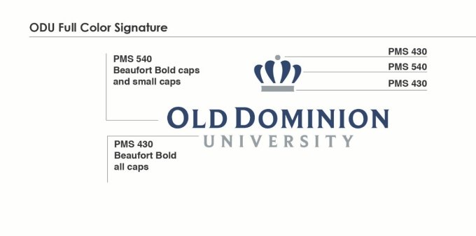
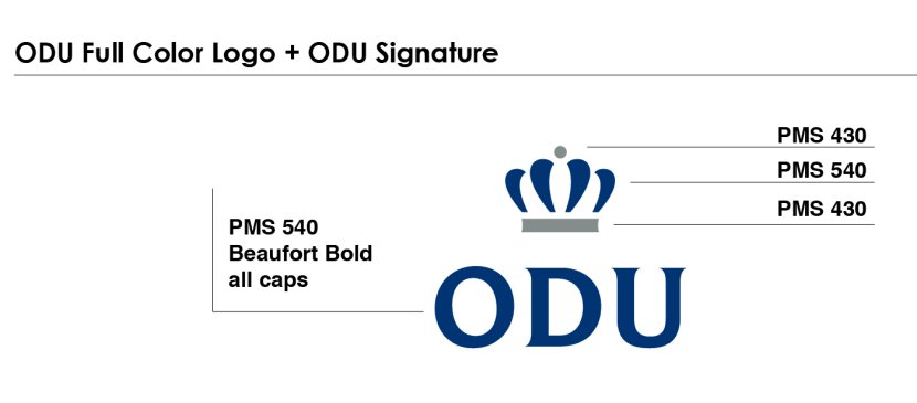
Two components make up the ODU signature: the word mark and the logo. The word mark is rendered in the Beaufort Bold font (caps and small caps). The crown is a fresh expression of the qualities of prestige and leadership.
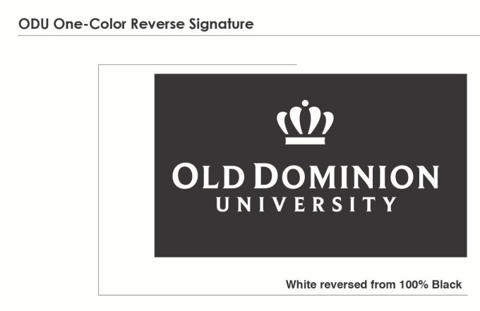
When presented in full color, the signature employs the school colors PMS 540 (blue) and PMS 430 (gray). When presented in a single color, 100% black or 100% PMS 540 is used to maintain the dimension of the signature. When reversed, the background must be a dark value so that the signature is clearly read - 100% black or PMS 540 is preferred.
ODU Full-Color Signature
ODU One-Color Signature
ODU One-Color Reverse Signature
ODU Full-Color "ODU" Signature
Signature Placement
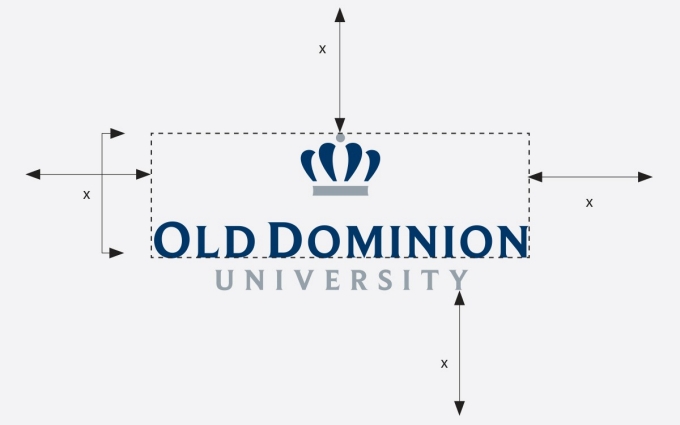
Keep the ODU signatures clearly visible. It is important to maintain a sufficient amount of space around the signature to ensure that it is distinct and easily identifiable. As a general guideline, the space around the signature should be the same as the height of the logo and "OLD DOMINION", or in the case of the ODU signature-the height of the logo and "ODU". No graphics, type or illustrations should appear in this clear space.
Signature Size
To ensure that the signature is legible, it's width should be no smaller than 1.75" for the full signature and for the "ODU" signature, no smaller than ".625".
Acceptable Signature Backgrounds
Legibility is paramount in the usage of the ODU signature. Therefore it should always be clearly visible against a background. All versions of the signature must appear on a white or very light (a color no darker than the look of a 10% screen of black) colored background. The reversed signature should be used on black, PMS 540 or suitable dark backgrounds. When placed on a photographic background, the area of the photograph where the signature is placed must be light or dark, not overly textured, or complex.
Incorrect Usage of Signature
To maintain the integrity of the ODU signatures they must be used within the guidelines outlined in this manual. Below are several examples of incorrect usage.
Incorrect sizing
When resizing the signature, do not distort it. In Word and PowerPoint particularly, only drag on the corners of the logo to resize correctly.
Using logo mark or word mark only
Do not separate the word mark from the full logo.
Altering the opacity
The ODU signature should be used at 100% opacity.
Altering the color
Use only the approved options for the ODU signature.


